Lead:
Fixing your pets decreases the likelihood that they go missing.
Excel Workbook Link & Explanation:
The data provided by the City of Vancouver clearly shows us that spayed/neutered pets are far less likely to go missing compared to those that are not fixed.
Link to Original Data Set:
My data set can be found here
News Story/Study Link & Summary:
The news story that best supports my findings and lead deals with research showing that a pet's hormones tend to relax when they are spayed and neutered. According to the article, most pets go missing/run away looking to breed - a natural instinct. However, getting your pet fixed calms those hormones and urges thus resulting in less runaway pets. This article fully backs my lead and findings.
Monday, 26 February 2018

Monday, 12 February 2018
Final Project: Update #1
For my Data Visualization course, I have been tasked with finding a set of data to analyze for what will be our final project. The following blog post will outline what said data is and some initial important questions surrounding it.
Which Data Set Will I Be Using?
The data set that I have decided to analyze deals with domestic animals that have gone missing in the City of Vancouver since 2001 (up to the present day).
What Kind of Data Does the Data Set Contain?
This data set provides the researcher with a plethora of information to work with. The name of the pet, a description (coat), the date it was reported missing, the pet's gender, and the breed of the animal.
What is Hard to Understand From the Data Set?
The only real obstacle I am faced with in regards to the data set itself is what "matched" means under the "state" column. I can figure this out in several ways, either calling a pound and asking or by seeing what I can dig up on the ol' World Wide Web. Beyond this, I feel like listing all different types of sub-breeds under the "breeds" column may created a bit of confusion, but I will see if there is a way to clarify all of that via Google or my instructor.
Questions I Hope To Answer From My Data Set
There are several questions I hope to answer through working with the data set:
1) What breed of animal is most likely to be lost in the City of Vancouver?
2) Are male or female animals more likely to go missing?
3) What year saw the most reported missing animals?
4) What percentage of animals that go missing in Vancouver end up being found? Is it more likely to lose your animal for good than recovering it?
Considering I work in animal feed and pet food, I am really interested in finding out the answer to some of these questions, and if more animals end up being recovered more often than lost for good, I may be able to shed some optimism on customers who have animals go missing!
Which Data Set Will I Be Using?
The data set that I have decided to analyze deals with domestic animals that have gone missing in the City of Vancouver since 2001 (up to the present day).
What Kind of Data Does the Data Set Contain?
This data set provides the researcher with a plethora of information to work with. The name of the pet, a description (coat), the date it was reported missing, the pet's gender, and the breed of the animal.
What is Hard to Understand From the Data Set?
The only real obstacle I am faced with in regards to the data set itself is what "matched" means under the "state" column. I can figure this out in several ways, either calling a pound and asking or by seeing what I can dig up on the ol' World Wide Web. Beyond this, I feel like listing all different types of sub-breeds under the "breeds" column may created a bit of confusion, but I will see if there is a way to clarify all of that via Google or my instructor.
Questions I Hope To Answer From My Data Set
There are several questions I hope to answer through working with the data set:
1) What breed of animal is most likely to be lost in the City of Vancouver?
2) Are male or female animals more likely to go missing?
3) What year saw the most reported missing animals?
4) What percentage of animals that go missing in Vancouver end up being found? Is it more likely to lose your animal for good than recovering it?
Considering I work in animal feed and pet food, I am really interested in finding out the answer to some of these questions, and if more animals end up being recovered more often than lost for good, I may be able to shed some optimism on customers who have animals go missing!
Monday, 22 January 2018
Data Viz Analysis: Edmonton Homicides 2017: Who, What, Where, When & How
Being aware of crime rates in your city (and surrounding area) is always important, and there are several crimes in particular that require an enhanced focus - homicide, for example, would top that list for most people.
Towards the end of 2017, Global News Edmonton posted an article focusing on homicides in and around the city of Edmonton and used a data visualization (map) to show the location of the homicide and how the victim was killed. At the time of publication, there had been 40 homicides. Given the magnitude of the crime, the data visualization provided by Global was great in some aspects, but also lacking in other respects.
What did the visualization do poorly? Well, at first glance the map just looks like a cluster of different coloured markers – this does not really provide much information other than the fact there are a lot of people being killed in Edmonton. Another issue with the visualization is that the reader has to expand the map to fully grasp the information, which is not a problem, except for the fact that the writer does not explain that to their audience. Beyond this, adding a bar chart showing the type of homicide vs. amount of victims to supplement the map could have paid dividends for the visualization. Finally, it is interesting that they included “smoke inhalation” (the house fire was an arson, but this should then be manslaughter) and “drug overdose” as homicides – could this have been done intentionally to create a “shock factor” from the article?

The strengths of the visualization come after the reader expands the original viz within the article. In this expanded view, the markers provide a lot more information than before. Now we can see the exact location of the homicide and how it happened. This view of the visualization answers several questions, which makes it an effective visualization of data. We can now answer questions like: what is the most common type of homicide? In what part of Edmonton can we find the most killings (144 avenue NW)? Where are the most dangerous areas (Rundle Park)? Is there any correlation between location and murder weapon? These, among other questions, can be answered by this visualization.

In summation, this visualization is effective in that it provides important information to the reader on an important crime statistic. While it is a bit awkward in a technical sense (e.g. if the reader is not very tech savvy), it is functional and operates as an overall good presentation of data.
Towards the end of 2017, Global News Edmonton posted an article focusing on homicides in and around the city of Edmonton and used a data visualization (map) to show the location of the homicide and how the victim was killed. At the time of publication, there had been 40 homicides. Given the magnitude of the crime, the data visualization provided by Global was great in some aspects, but also lacking in other respects.
What did the visualization do poorly? Well, at first glance the map just looks like a cluster of different coloured markers – this does not really provide much information other than the fact there are a lot of people being killed in Edmonton. Another issue with the visualization is that the reader has to expand the map to fully grasp the information, which is not a problem, except for the fact that the writer does not explain that to their audience. Beyond this, adding a bar chart showing the type of homicide vs. amount of victims to supplement the map could have paid dividends for the visualization. Finally, it is interesting that they included “smoke inhalation” (the house fire was an arson, but this should then be manslaughter) and “drug overdose” as homicides – could this have been done intentionally to create a “shock factor” from the article?

The strengths of the visualization come after the reader expands the original viz within the article. In this expanded view, the markers provide a lot more information than before. Now we can see the exact location of the homicide and how it happened. This view of the visualization answers several questions, which makes it an effective visualization of data. We can now answer questions like: what is the most common type of homicide? In what part of Edmonton can we find the most killings (144 avenue NW)? Where are the most dangerous areas (Rundle Park)? Is there any correlation between location and murder weapon? These, among other questions, can be answered by this visualization.

In summation, this visualization is effective in that it provides important information to the reader on an important crime statistic. While it is a bit awkward in a technical sense (e.g. if the reader is not very tech savvy), it is functional and operates as an overall good presentation of data.
Monday, 15 January 2018
embed code test
here is the chart I wanted to embed.
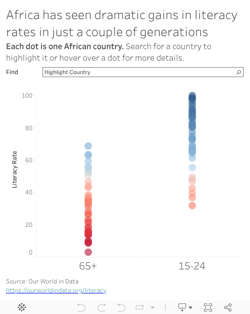
The charted I wanted to embed is above this sentence
The charted I wanted to embed is above this sentence

Subscribe to:
Posts (Atom)